

Understanding users' behavior can help guide product development and improve customer retention. This article demonstrates how to use FusionAuth to track customer statistics. Understanding why customers stay or leave might require data from your application database. But FusionAuth login statistics can help you understand who your customers are, and help you sort them into cohorts (groups). Cohort analysis allows you to answer questions like:
- How frequently do customers use your app?
- How many people register but quickly lose interest in your application?
- Did new features or advertising campaigns entice new users or irritate existing users?
FusionAuth Native Reports#
FusionAuth has a few built-in charts with views of total logins and registrations in the Reports section.
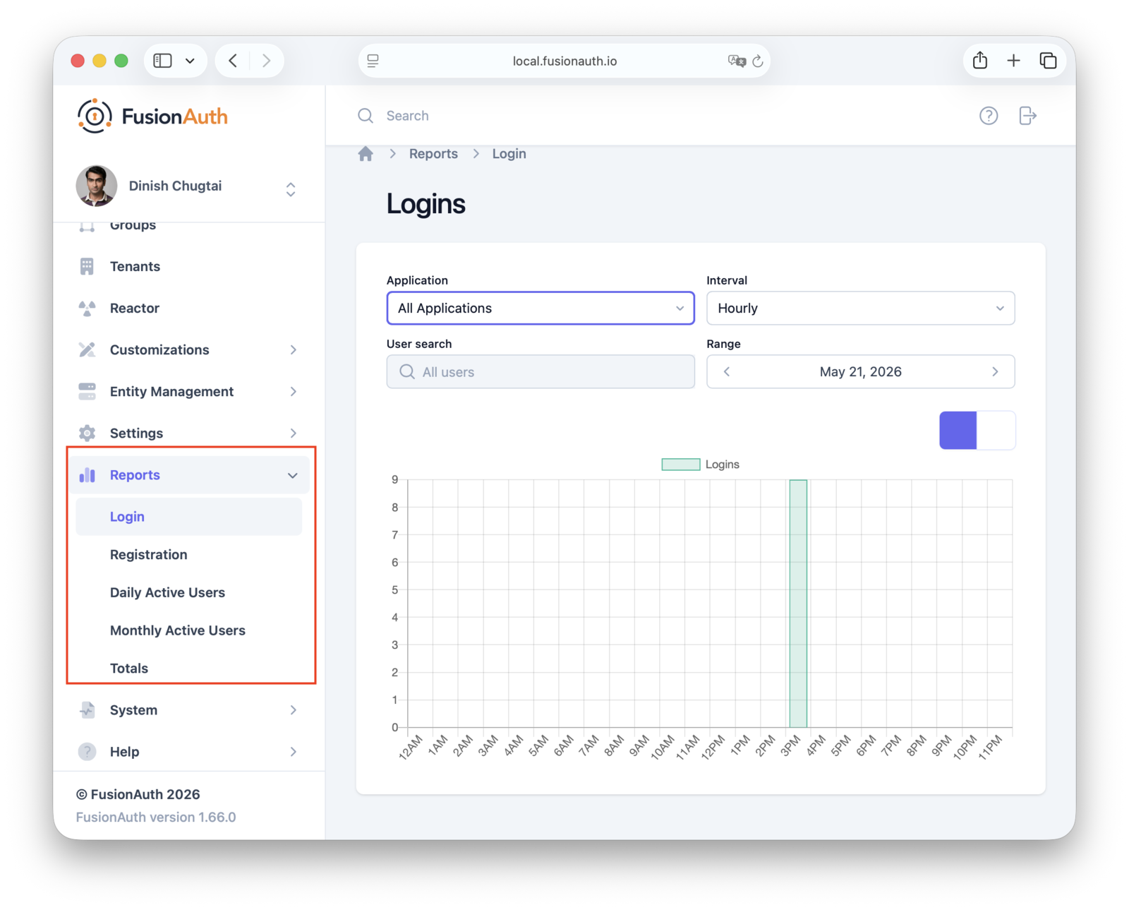
The FusionAuth admin UI provides several charts, showing:
- Login shows the number of logins per application, time period, and user.
- Registration shows the number of registrations per application and time period.
- Daily Active Users shows the number of daily active users per application and time period.
- Monthly Active Users shows the number of monthly active users per application and time period.
Because more complex charts require time-consuming calculations, additional charts aren't available in FusionAuth. However, you can export your data and calculate the statistics. This guide walks you through that process.
Many charts shown in this guide depend on the expiry duration of your login tokens. Longer expiry times mean that users log in less frequently. You can adjust the sample code accompanying this guide to analyze a period that makes sense for your FusionAuth configuration. For more information on token durations, see the session management documentation.
An Overview of Cohort Analysis#
Cohort analysis is a behavioral analytics technique that groups users by shared characteristics or experiences within a period. You can then track the actions of each group over time.
Any cohort analysis involves at least the following concepts:
- Cohort: a group of users
- Metric: the behavior you are measuring (e.g. logins, purchases, feature usage)
- Time Horizon: the period of time to gather measurements from (e.g. Day 0, Weeks 1-10, Month 4)
Cohort analysis can help you distinguish between growth and retention. For example, consider a product with 10,000 active users. Cohort analysis can reveal that:
- 9,000 users registered this month (growth)
- only 5% of users from six months ago returned (retention)
This indicates an abandonment problem. Growth is sufficient to mask this problem until you investigate retention.
Conversely, another product might have only 1,000 users but 95% returning. This is a healthier app than the previous example, even if it has fewer users.
Understanding Additional User Charts#
Later on, we'll show you the code that generates some helpful charts using your FusionAuth user registration and login data. You can jump to the code if you want to run it against your instance. For now, let's take a look at the charts, and what you can learn from them.
The following charts were created from 20,000 mock users with randomly generated registration and login dates, so they don't depict realistic patterns, but instead illustrate the concepts.
Total Users Chart#
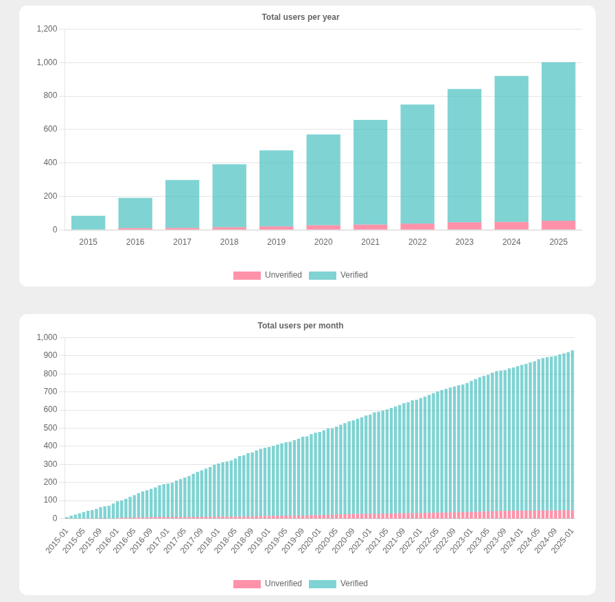
The total user chart shows the number of users who have registered for your application. This allows you to see whether your business is growing as you expect. These numbers include users who are no longer active, so you need to compare the total users with the user activity and abandonment metrics, which you'll see charts for later.
Like many other charts, the total users chart separates users into those who verified themselves (confirming their email address or phone number) and those who did not. Depending on your configuration, unverified users may be outliers in your data, distorting your statistics. For instance, if you gate activity until the user is verified, unverified users may not find much value in your application and are unlikely to be engaged.
User Acquisition Chart#
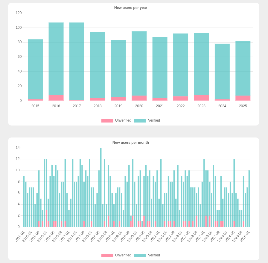
A user acquisition chart can help you understand the rate at which your application attracts new users. Combined with a timeline of advertising campaigns and feature releases, you can assess the value of those efforts. Spikes and dips in the chart can provide valuable information about user sentiment.
User Age Chart#
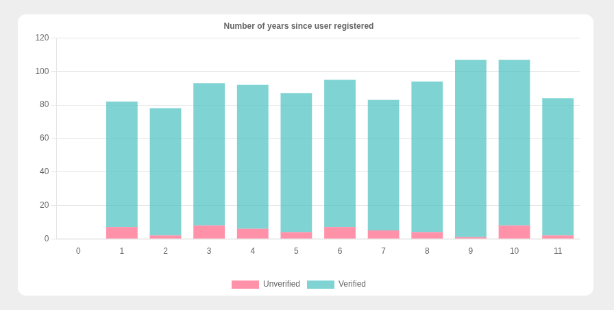
The age chart groups users by the number of years they have used your application. It's an indication of how much experience the average user has with your business.
This chart is a mirror image of the new users per year chart. A user who registered in 2020 will have been registered for six years in 2026.
Logins per Year Chart#
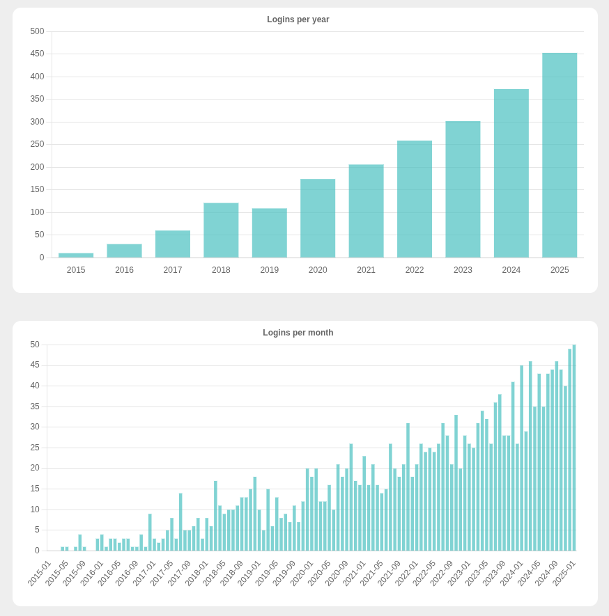
The logins per year chart shows how active your users are.
Sometimes it's more meaningful to work with deduplicated logins for a period. In other words, if a user logs in more than once in a year or month, they are counted as logging in only once in that period. This prevents a small fraction of users who log in frequently from making the application appear more used than it actually is.
Percent Logins per Year Chart#
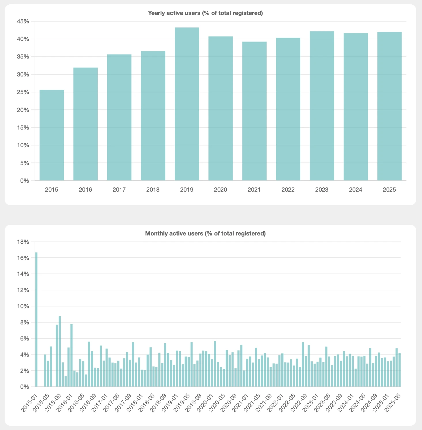
The percent login charts tease out useful information about user activity that may be hidden in the previous charts. These show the ratio of logins to users.
In 2025, you can see that around 42% of users actively use the application. Usage peaked in 2019 and has since stabilized, indicating that the example business became increasingly valuable to customers over time before reaching a steady state.
Percent logins charts may help you identify high and low points in your customer authentications.
Abandonment Chart#
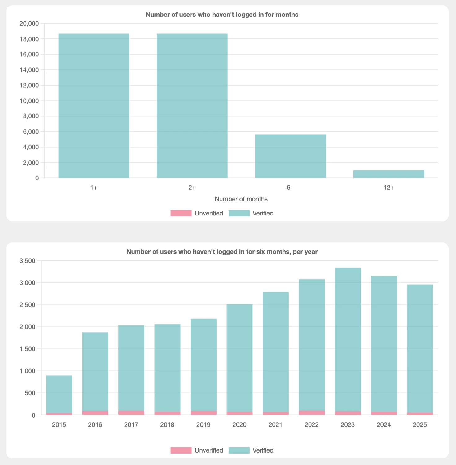
The first abandonment chart is the opposite of user activity. Each user is counted in every bucket they qualify for based on how long it's been since their last login: 1+, 2+, 6+, and 12+ months. Around 19,000 users haven't logged in for at least a month (1+), while only around 1,000 haven't logged in for over a year (12+).
While the first chart is a static metric calculated today, the second abandonment chart shows the trend of users who haven't logged in for at least six months per year. This amount steadily increases over time, which contradicts the percent login chart that showed users logging in more each year.
This apparent contradiction is because the percent login chart is relative (showing a percentage of users) and the abandonment chart is absolute (showing the number of users).
You can change any absolute chart to a relative chart by modifying the code and dividing the annual or monthly value by the number of users in that year or month.
Activity Cohort Chart#
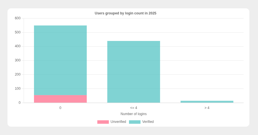
The activity cohort chart groups users by how frequently they use the application. Here, you can see most users who registered in 2025 don't log in at all. A large number of users logged in up to four times in the last year, with others logging in more often. The duration here is the calendar year of 2025.
You'll want to modify the durations used to match your business and session expiry settings.
Returning Users Chart#
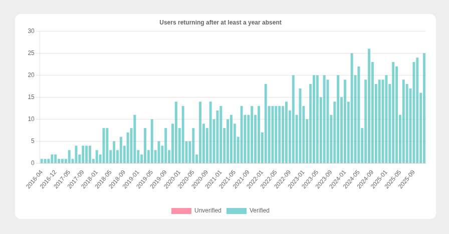
The returning users chart shows how many users log in after at least a year of not using your application.
If you have clear spikes, they might correlate to the release of new versions or features, marketing campaigns you ran, or customers leaving a competitor. Logins can also correlate to the cycles of your business; a tax preparation application might expect a yearly spike around tax day, where a gaming application might see a spike every new game release.
This is similar to the user acquisition chart, but highlights customers already familiar with your offering who come back to give it another try.
Friction Chart#
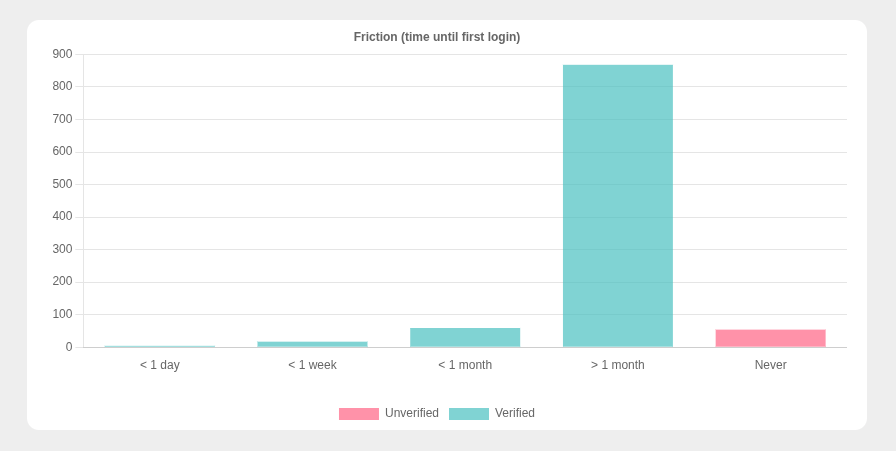
The friction chart groups users by how long it takes a user to log in for the first time after registering. This shows how easily a user flows from registration to usage. If users realize while registering that your application isn't what they're really looking for, they may never log in a second time.
This example chart shows that nearly all users do log in (indicating high interest), but only after a month, suggesting the business should make it easier.
FusionAuth creates a login record at the moment of application registration, so the extraction code skips the first login date for each user. Without this, every user would appear to have zero friction, since their first login would always match their registration date.
Login Frequency Chart#
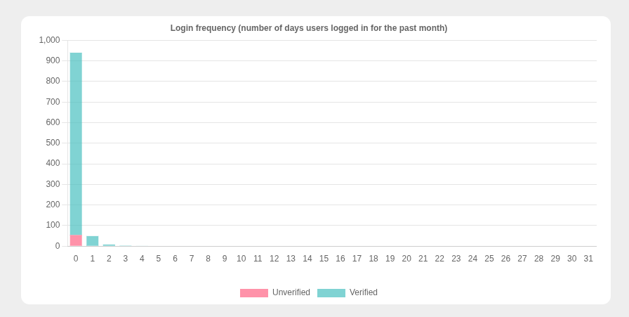
The login frequency chart groups users by their number of logins in the past month. For most applications, you want this chart to have higher bars to the right. That indicates that most people are logging in daily.
In this example, the vast majority of users didn't log in at all in the last month. Depending on your business, that may mean it is not currently healthy.
On the other hand, if this is an application where people pay their utility bills, users logging in once a month may be perfectly normal. However, if users only log in once a year, that'd be problematic.
This chart is also known as the L30 chart or Power User Curve.
Cohort Analysis Chart#
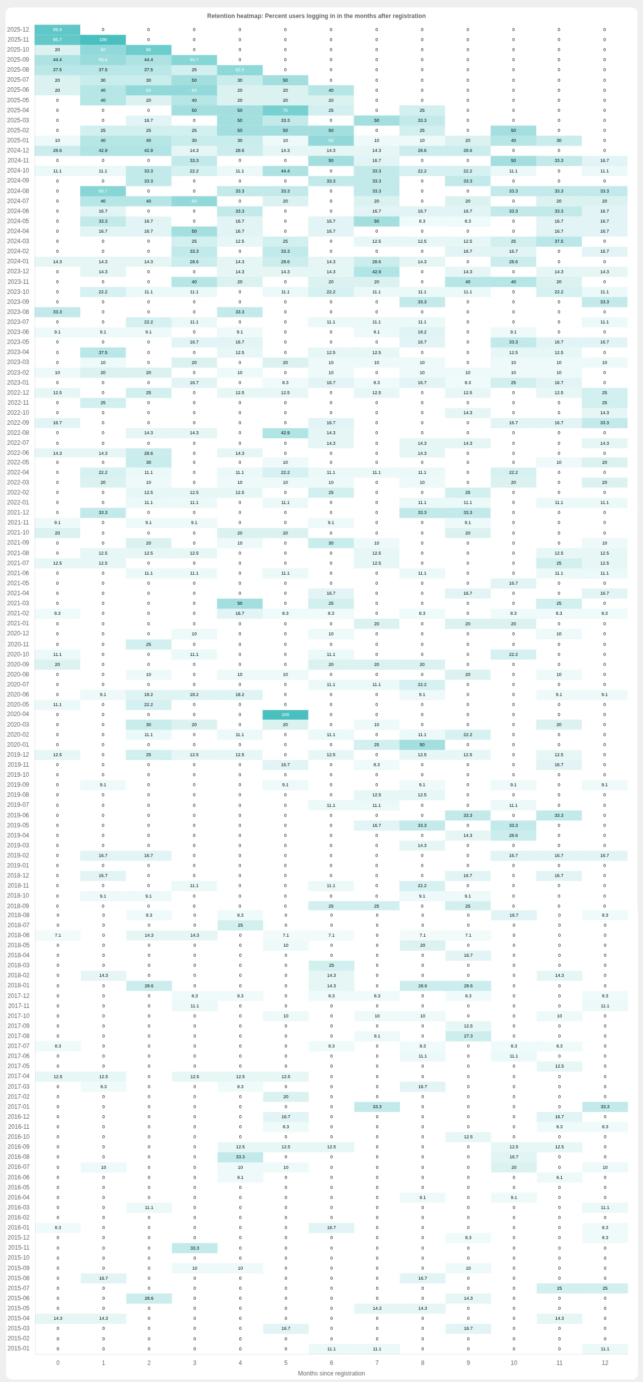
The cohort analysis chart is a heatmap that shows user retention per month for the year following registration. The x-axis shows the number of months after registration, from 0 to 12. The y-axis shows the month of registration. Pick any row and read the chart from left to right to see how many users logged in during the first month after registration, the second month, and so on. You'll likely see most users log in a lot in the first month or two, and slowly decline in logins over the next twelve months. If the decline tends towards zero, however, your application doesn't provide long-term value to customers.
The y-axis shows whether your business is getting better or worse at retaining customers over time. In this example, you can see the business has become better with retention over time, as there are darker colors higher in the chart.
Create Charts for Your FusionAuth Instance#
To create the charts above for your business, you need to have Go installed.
You also need to have an instance of FusionAuth with the data you want to analyze. If you don't have any data yet, use the process and the code in the appendix to create test data.
Extract Customer Data#
While application databases like FusionAuth store data in a normalized structure to save space, data analysis requires denormalized data for fast retrieval and computation.
The first step to analyze your user data in FusionAuth is to extract it and store it in a usable format.
Use Git to clone the accompanying repository:
$ git clone https://github.com/FusionAuth/fusionauth-example-cohort-analysis.git
Navigate into the repo:
$ cd fusionauth-user-charts
Copy .env.example to .env and edit it to match your FusionAuth URL, API key, and application Id. If you want to see charts for multiple applications, use different environment variable files and run the extraction and display process multiple times.
For production, create a global API key with minimal permissions. The key must have the following permissions:
- The
GETpermission on the/api/userendpoint - The
GETandPOSTpermissions on the/api/user/searchendpoint - The
GETandPOSTpermissions on the/api/system/login-record/searchendpoint
For development, you can use a superuser API key.
On up-to-date FusionAuth instances, the script reads the verified status from each user's identity data. On older instances where identity data is not returned by the search API, it falls back to a top-level verified field. The login history is unaffected either way.
To run the user extraction, use the following command:
$ go mod tidy && go run extractUsers.go
The extraction creates users.json, which contains the processed set of users with all login dates.
The users.json file has the following structure:
  [{
    id: string
    email: string
    isVerified: bool
    registeredDate: number // timestamp since 1970
    loginDates: number[] // oldest dates first
  }]
The extraction script uses the FusionAuth Go SDK to retrieve users, then fetch login dates for each user.
The extraction script replaces each user's ID and email address with a random UUID before saving to JSON, so the output file contains no personally identifiable information.
Calculate and Display the Charts#
The last step is to run the web server that displays the charts.
Run the following command:
$ go mod tidy && go run charts.go
You don't need to edit any parameters or constants this time; the code makes the charts from the JSON files and doesn't talk to FusionAuth.
When the web server is ready to display your charts, you should see the following output in your terminal:
Charts created
Server listening at http://0.0.0.0:7777
To view your charts, visit http://localhost:7777.
The web server reads all data from users.json in the main() function, calculates the charts, then uses charts.html as an in-memory template and returns the rendered page when requested. Each chart calculates in parallel, using the runParallel() function in the getChartData() function.
If you want to change a chart, you can edit its calculation function without breaking any of the others. They are all independent. If you want to add a new chart, create a new function and call it from getChartData(). If any chart takes too long to calculate, comment out the function call, and in charts.html, comment out the chart display. The HTML uses Chart.js for charts.
Some charts use all login dates and some use unique logins per month or year. If you want to use these deduplicated dates in your own charts, use the LoginDatesUniqueYearly and LoginDatesUniqueMonthly variables.
Next Steps#
In this guide you learned how to use basic FusionAuth login data to analyze user behavior. Visualizing user behavior is foundational to determining which parts of your business offer the most value to customers and understanding how to keep them engaged.
If you see any patterns you want to investigate further, you can modify the getUsersFromFaUsers to not anonymize the users. Then you can log the user Ids of any group that interests you and use those Ids to investigate user behavior further. Follow any laws around protecting your user data if you pursue this.
Appendix — How to Create Fake Customer Data in FusionAuth#
To create fake users and login data for a FusionAuth application, you need to run a Go file and SQL script. There is no way to create fake dates using the FusionAuth API, so you need direct database access to run the SQL. This works great when you are running locally or when you self-host, but instances running in FusionAuth Cloud don't allow direct database access.
If you haven't done so already, use Git to clone the accompanying repository:
$ git clone https://github.com/FusionAuth/fusionauth-example-cohort-analysis.git
Navigate into the repo:
$ cd fusionauth-user-charts
If you skipped the extraction step, copy .env.example to .env and edit it to match your FusionAuth instance. Then run the file with the following command:
$ go run createMockData.go
Once the users are registered, you need to randomize their registration dates, set 5% of user email addresses to unverified, and create thousands of login events. To do this, you can either connect to your FusionAuth database in a SQL browser and run the contents of createMockData.sql, or use the following command with the PostgreSQL binary:
$ PGPASSWORD=<your_db_password> psql -h <your_db_host> -U <your_db_user> -d fusionauth -v fusionauth_app_id=<your_application_id> -f createMockData.sql
Replace <your_db_password>, <your_db_host>, and <your_db_user> with your database credentials. Replace <your_application_id> with your FusionAuth application Id, which you can find in your .env file.
That's all. You are now ready to run the extraction and chart creation scripts.