Simple Theme Editor
Available since version 1.51.0
The Simple Theme Editor allows you to quickly get up and running with a custom FusionAuth theme by selecting a few styles, and without needing to edit any Freemarker or HTML. If you would rather not use the Admin UI you can also update a theme via the Themes API.
The alternative is to use the Advanced Theme Editor, which lets you control every aspect of the look and feel of your themes but with significantly more complexity.
Difference From Advanced Themes#
FusionAuth allows you to take full control over all of the hosted pages by creating an advanced theme and editing the HTML, CSS, and messages. This is a powerful way to create a fully custom experience, but it can be complex and time-consuming.
Instead of editing the templates directly, the Simple Theme Editor allows you to select from a set of pre-built themes and customize them with a few simple options. This is a great way to get started with customizing FusionAuth without needing to write any code.
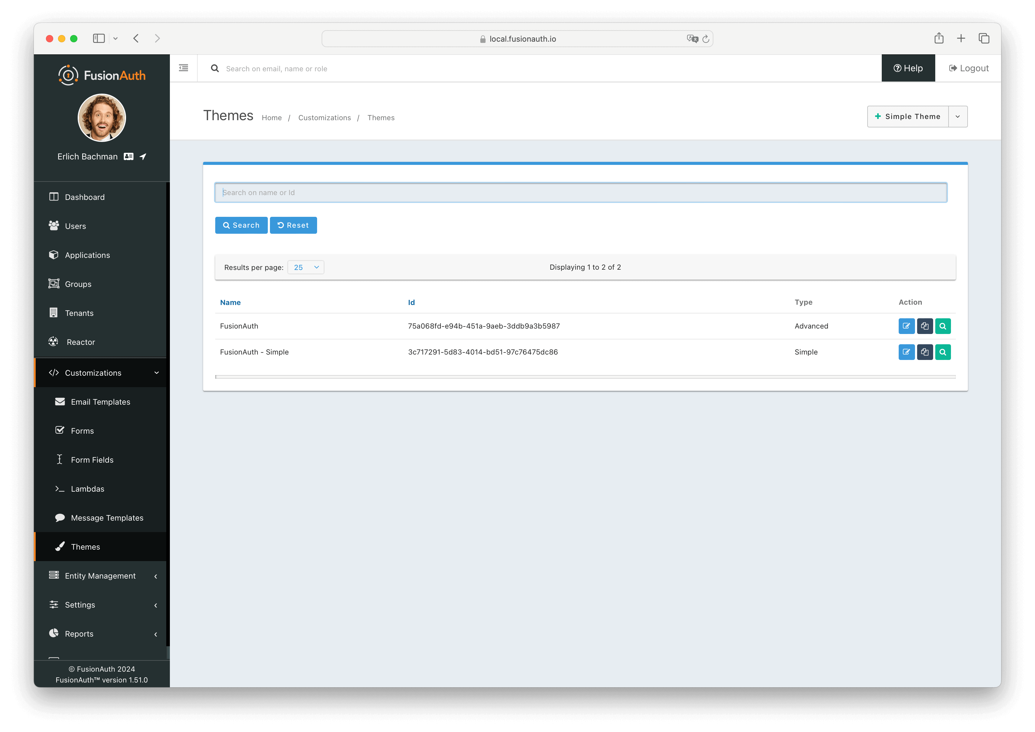
Creating And Editing Themes#
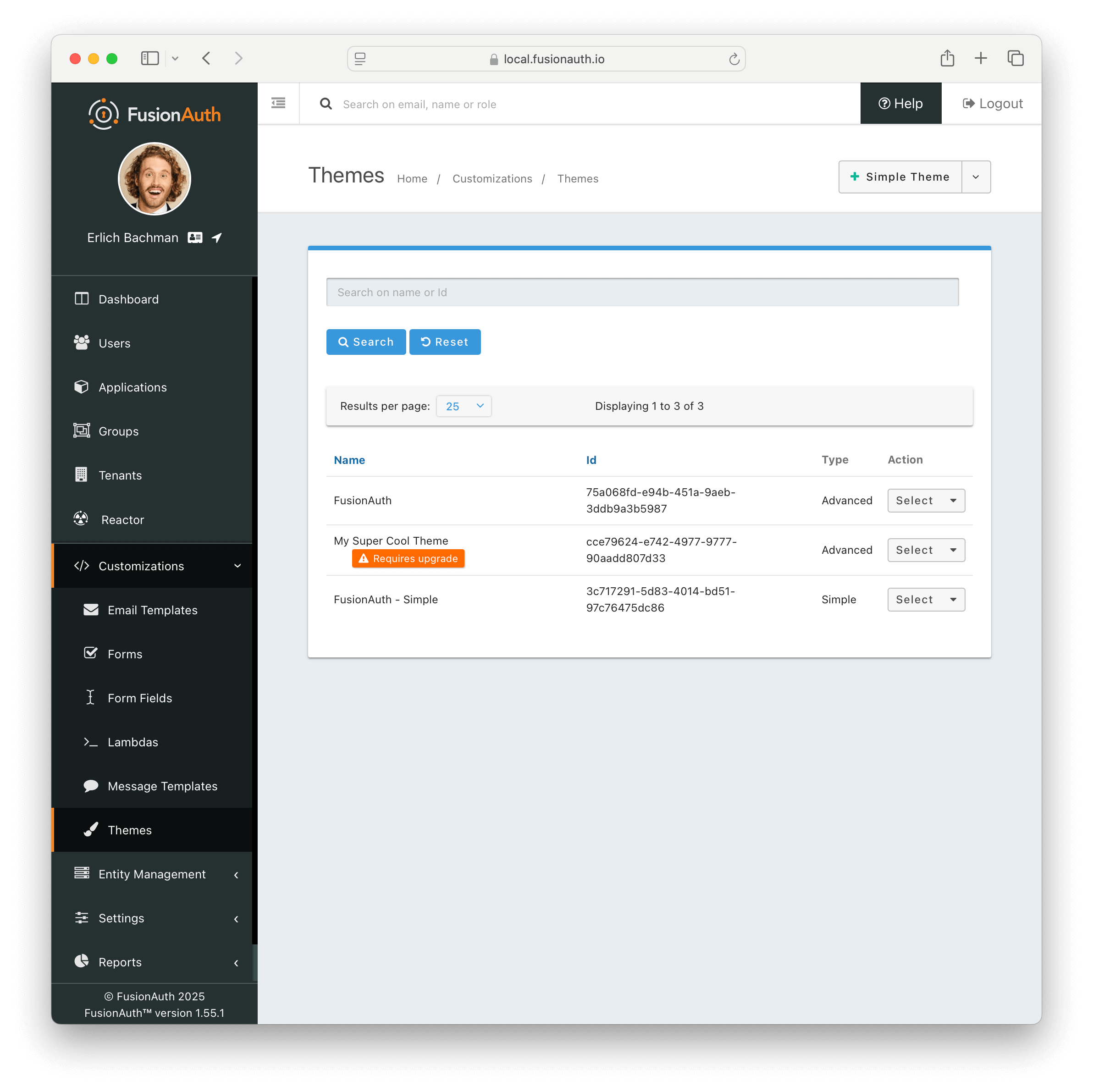
To get started with the Simple Theme Editor, navigate to Customizations -> Themes in the FusionAuth admin UI and either select the Add Simple Theme button from the top-right or click the Duplicate button on the default FusionAuth simple theme (the one with the name FusionAuth - Simple ). The default simple theme is read-only and can be viewed, but not edited.
To edit an existing simple theme, click the button next to your theme.
Once inside the Customize theme page there is a section at the top where you can edit the name and Id of the theme, and some panels below where you can change settings and preview your changes.
In the lower part of the editor you'll find three main panels. The leftmost panel contains a set of buttons that control the editing tools that you'll see in the rightmost panel. They are:
In the center of the editor, you'll see a preview panel, where you can see what your edits will look like on the different theme templates.
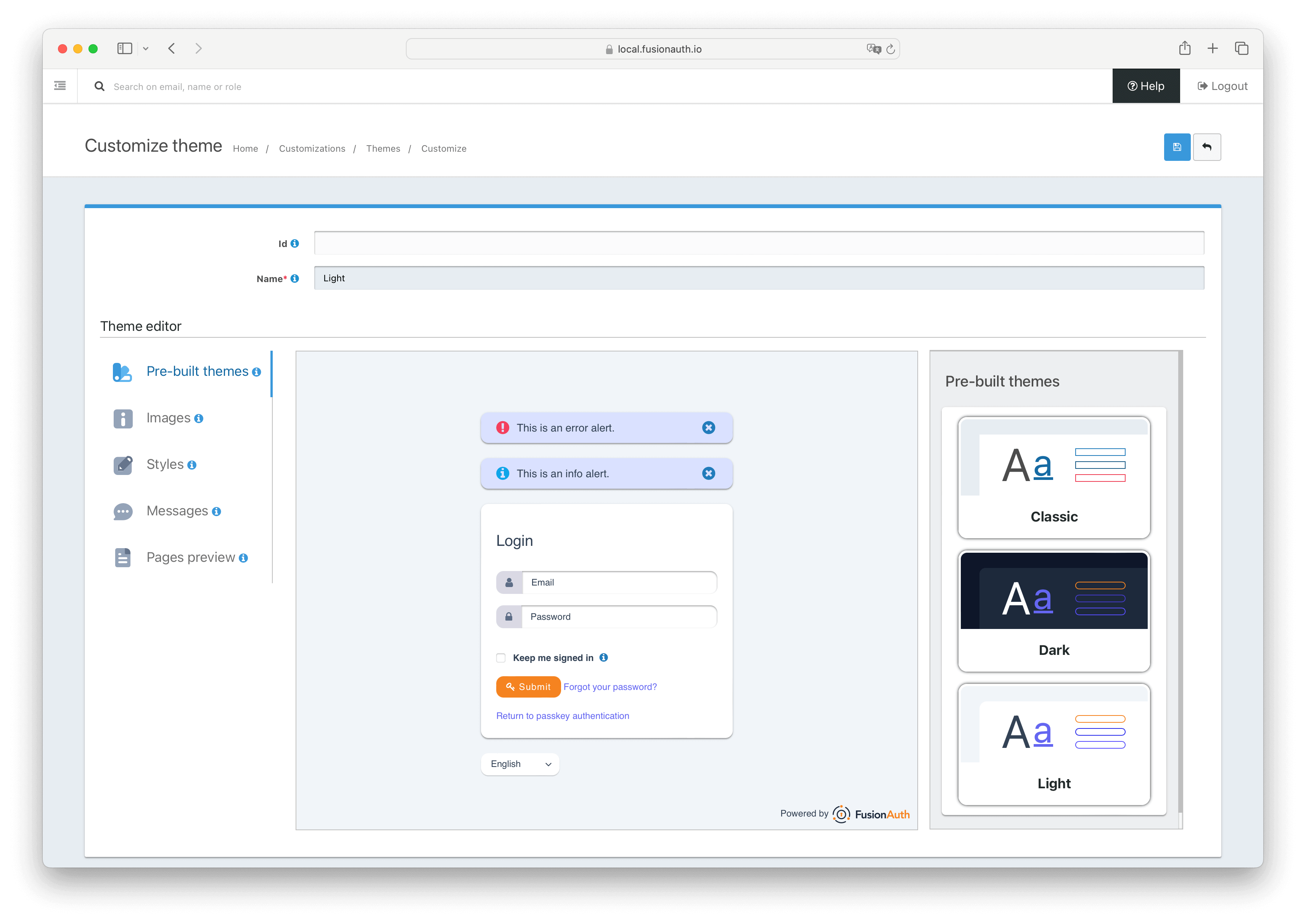
Name And Id#
In the top section, you can choose a name and Id for your theme. A unique name is required, but an Id will be assigned automatically if you don't provide one.
IdoptionalAn optional UUID. When this value is omitted a unique Id will be generated automatically.
NamerequiredA unique name to identify the theme. This name is for display purposes only and it can be modified later if desired.
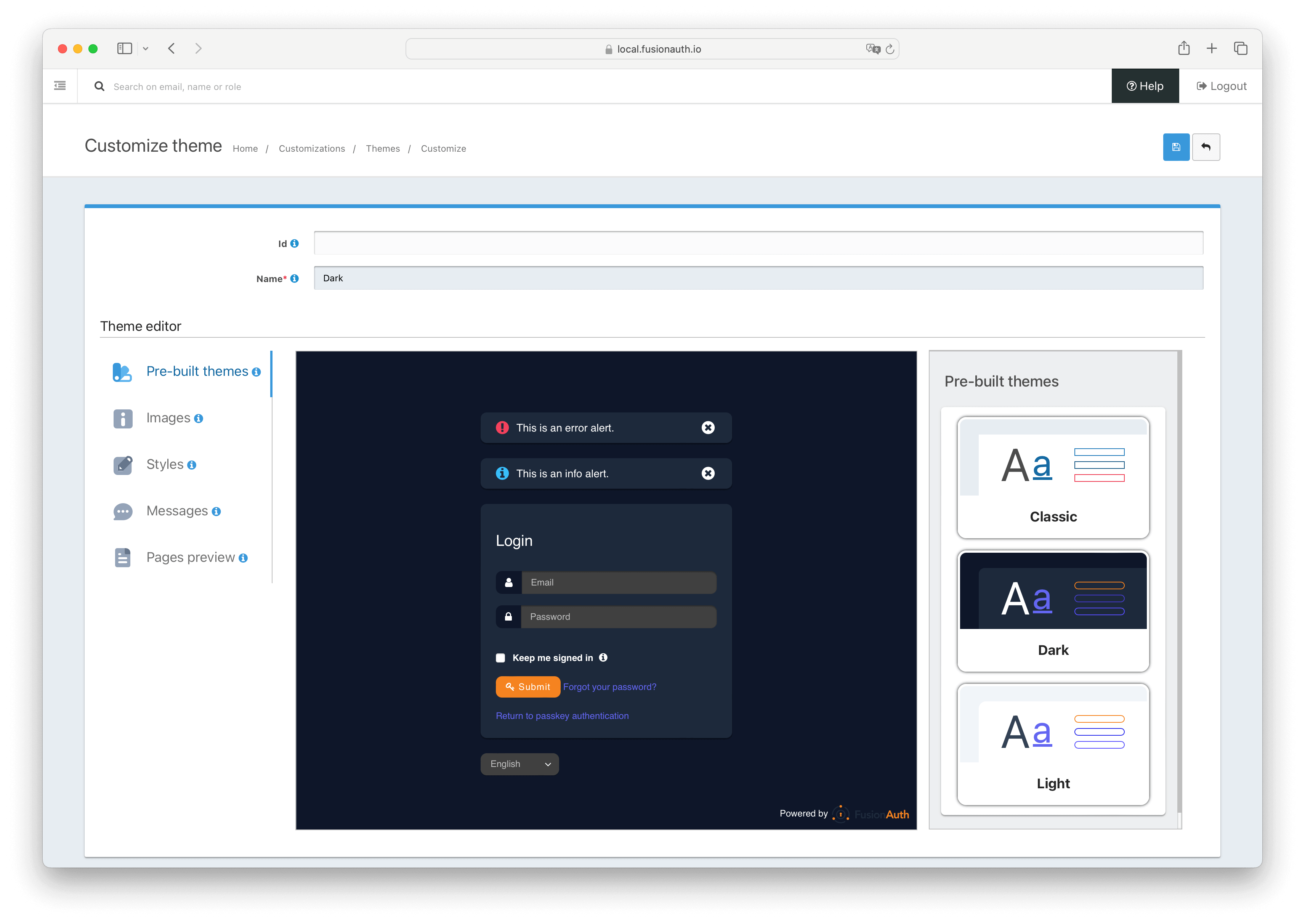
Pre-Built Themes#
Out of the box, FusionAuth provides three pre-built themes that you can select from. These provide a starting point, from which you can make changes. They are:
- Classic - This theme closely resembles the stock FusionAuth theme that you see with the default FusionAuth advanced theme
- Dark - A darker theme featuring FusionAuth brand colors
- Light - A lighter theme featuring FusionAuth brand colors
Selecting one of these will change all the styles currently set for the theme. If you have any un-saved changes in the editor when you select one of these, those changes will be discarded. In this case you'll be asked to confirm that you want to lose your changes and load a new pre-built theme.
Images#
In the Images section you can provide links to logo and page background images that will be used in the theme. You'll also find settings that control image sizing and placement. FusionAuth does not yet support uploading assets to be hosted, so these must be fully-qualified URLs that link to externally hosted images.
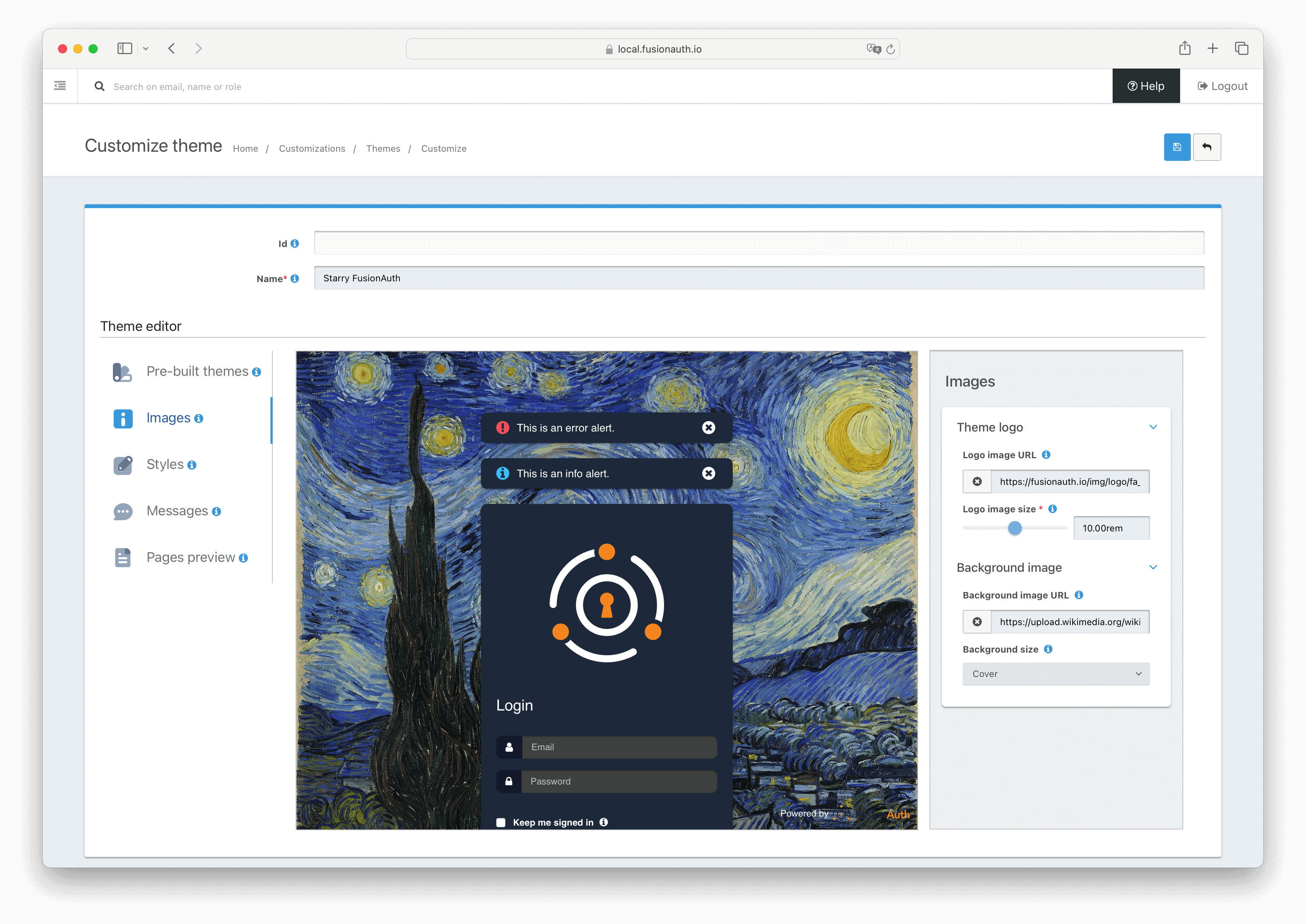
Theme logo#
This is the image that will be displayed at the top of the panel on most of the FusionAuth hosted pages.
Logo image URLoptionalThe fully-qualified URL to the image that will be used as the logo.
Logo image sizeThis slider determines how large the logo image will be. The slider defaults to rem units, but you can use em or px as well if you know what size that the image should be. Required if the Logo image URL is set.
Favicon#
An image used to identify hosted pages in the browser. Typically displayed next to the page title in the tab or address bar of a user's browser.
Favicon image URLThe fully-qualified URL to the image that will be used as the favicon. Available since 1.65.0
Background image#
This image will be used as the page background on all hosted pages. This setting supersedes a page background color.
Background image URLThe fully-qualified URL to the image that will be used as the page background.
Background sizeThis dropdown controls the the background-repeat and background-size properties of the background image.There are three options:
- Contain - sets the background-size property of the background image to
containand the background-repeat property tono-repeat. This will leave the image in its original aspect ratio and not repeat it, and size it to the width of the screen. Below the image will be the theme background color. - Cover - sets the background-size property of the background image to
cover. This will size the image to cover the entire background, cropping it if necessary to maintain the aspect ratio. - Repeat - sets the background-repeat property of the background image to
repeat. This will repeat the image in both the x and y directions and retain its original size.
Styles#
There are three sub-sections in the Styles section that provide controls for most of the styles in the theme.
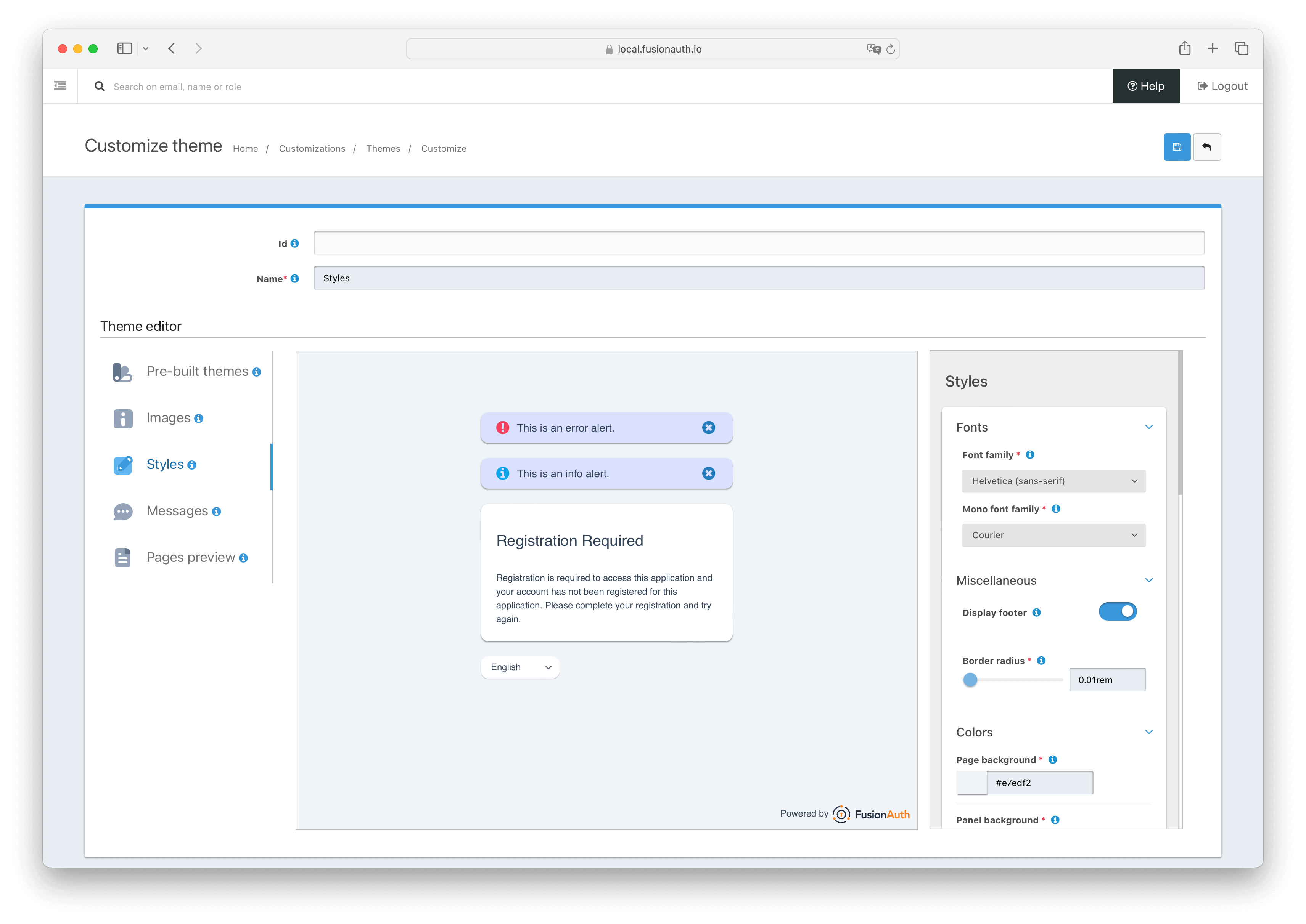
Fonts#
Here you can select from a list of common web fonts for the theme. You may also input a custom font-family value, but be aware that we cannot guarantee a custom font will be available to the browser and the rendered text may be the browser default.
Font familyrequiredThis is the font-family used for the majority of the text in the theme.
Custom font familyThis is the optional input for a custom font-family value.
Mono font familyrequiredThis is the font-family used for monospaced text in the theme, such as with MFA recovery codes.
Custom mono font familyThis is the optional input for a custom font-family value for monospaced text.
Miscellaneous#
Provides controls that don't belong in other sections.
Display footerToggles the "Powered by FusionAuth" footer on or off. Note: You must have a valid license to toggle off the footer.
Border radiusrequiredSets how rounded the corners of panels and form inputs are in the theme. The slider defaults to rem units, but you can use em or px as well if you know what value of the border radius should be.
Colors#
Controls for the various colors of the theme. Clicking on the square next to the input field will bring up the browser's color picker and allow you to select any color or use the eye-dropper tool to select a color on the screen. You may put any value into the input field as long as it is a valid hex, hsl, hsla, rgb, or rgba color value. Hovering over a color control will highlight the element on the page that the color applies to. The colors you can set are:
Page backgroundrequiredThe color of the background in the theme.
Panel backgroundrequiredThe color of the main content panel in the theme.
Alert backgroundrequiredThe color of the alert panels in the theme.
Alert fontrequiredThe color of the text in the alert panels in the theme.
FontrequiredThe color of the majority of the text in the theme.
Mono fontrequiredThe color of monospaced text in the theme, such as with MFA recovery codes.
Error fontrequiredThe color of error text in the theme.
LinkrequiredThe color of links in the theme.
IconrequiredThe color of the icons in the theme.
Info iconrequiredThe color of icon in the info alert panels in the theme.
Error iconrequiredThe color of icon in the error alert panels in the theme.
Input iconrequiredThe color of the icons for the input fields.
Input icon backgroundrequiredThe color of the background of the icons for the input fields.
Input textrequiredThe color of the text in the input fields.
Input backgroundrequiredThe color of the background of the input fields.
Primary buttonrequiredThe color of most buttons in the theme.
Primary button textrequiredThe color of the text on most buttons in the theme.
Delete buttonrequiredThe color of the delete buttons in the theme.
Delete button textrequiredThe color of the text on the delete buttons in the theme.
Messages#
Allows you to change any of the copy in the theme, and also provide localized versions of messages.
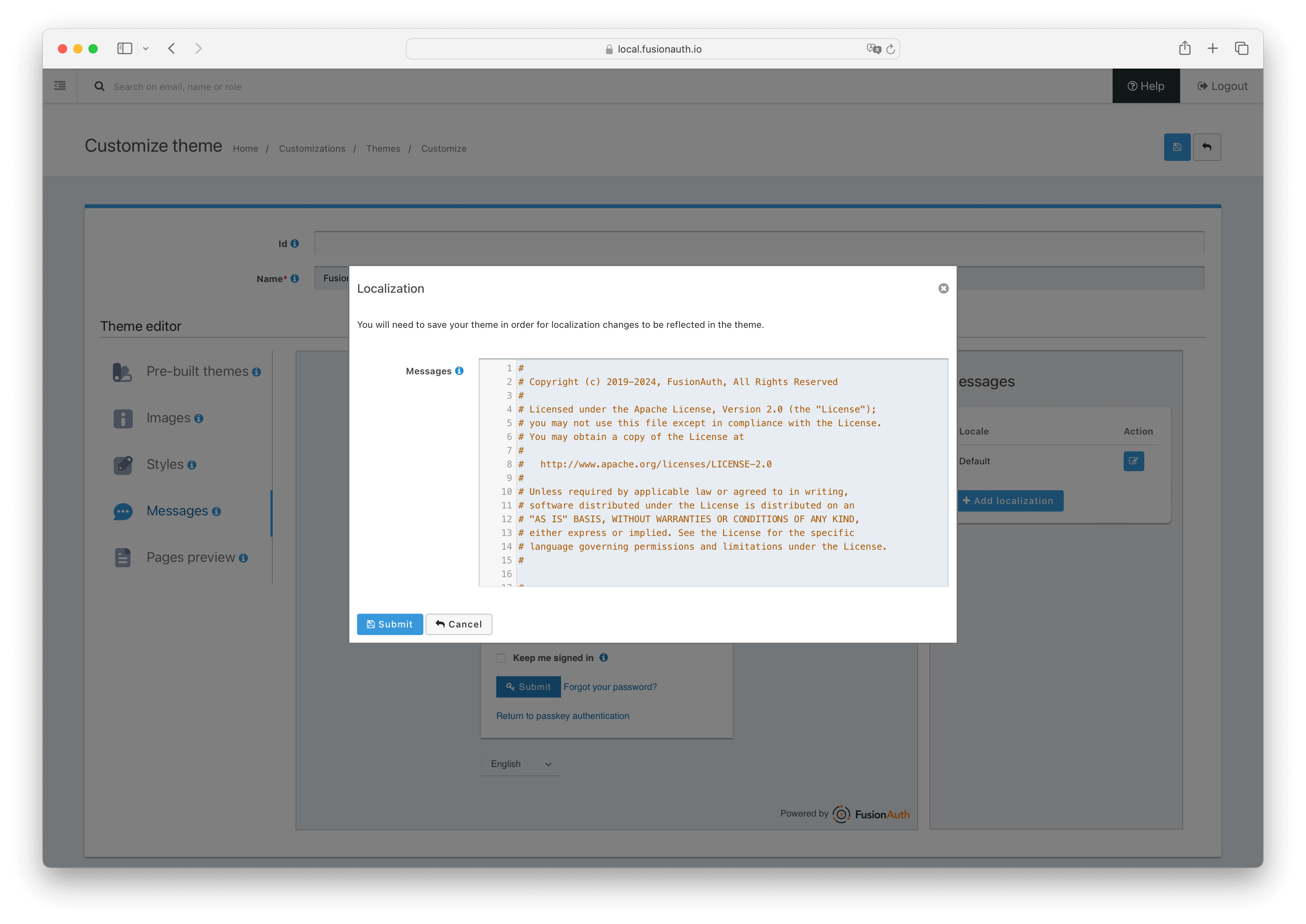
MessagesoptionalEditing the "Default" locale shows a read-only view containing a list of all default messages, with comments and groups explaining their uses. Below the read-only field is a Custom messages field.
To override the default messages with your own message values, edit the Custom messages field. For example, to change the page title for an OAuth2 login page, add the line oauth2-authorize-page-title=<My Example Login Page Title>.
See Theme Localization for more information.
Any changes made to the messaging will be shown in the preview, but the whole theme must be saved in order to persist those changes.
When creating an additional locale it is not required that all messages are defined for each language.
If you intend to localize your login templates, you may find our community contributed and maintained messages in our GitHub repository helpful.
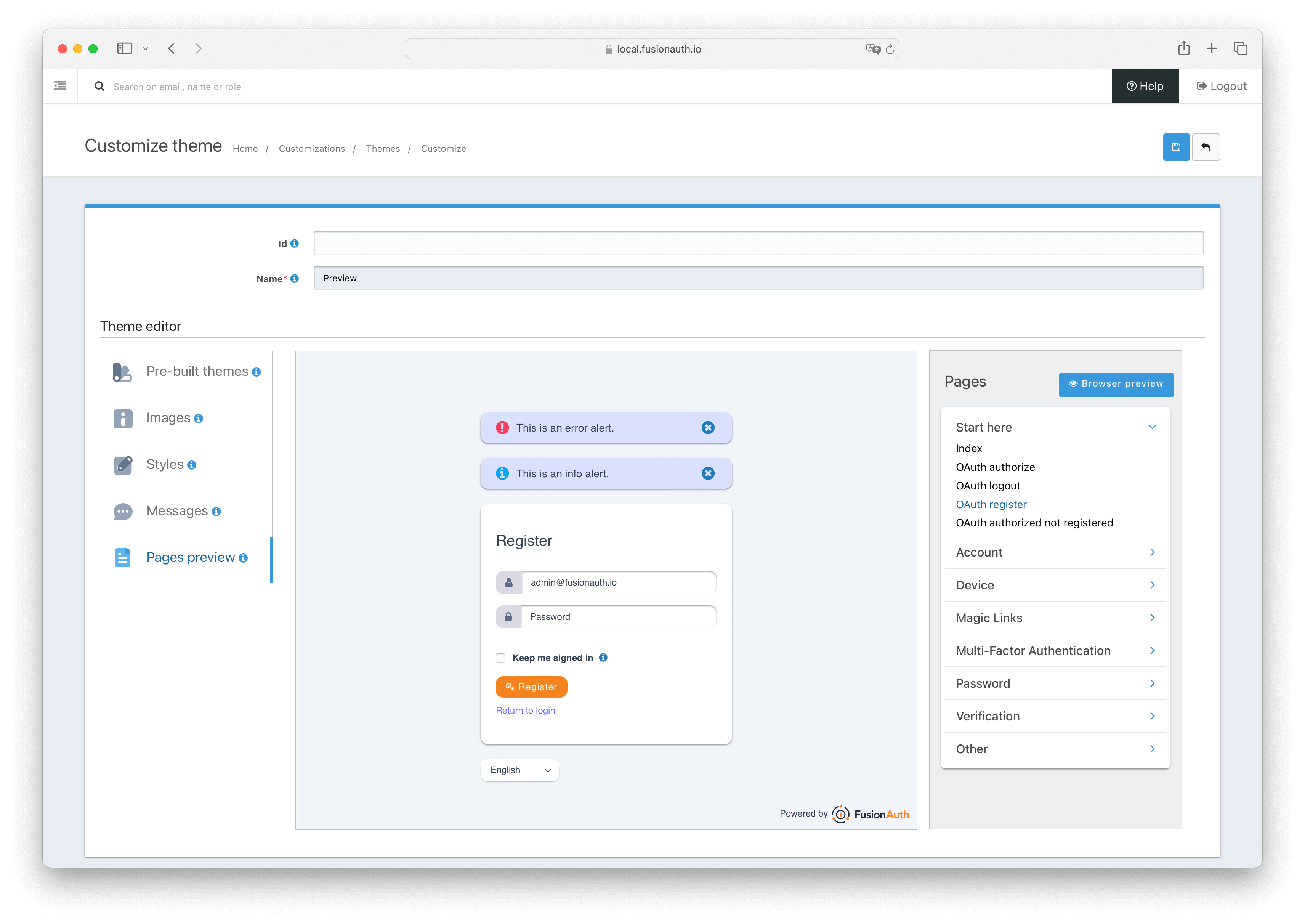
Pages Preview#
The Pages Preview section allows you to see what the theme will look like on the various FusionAuth hosted pages.
All the hosted pages are ordered into various categories, and you can click on any of them to change what is shown in the preview pane.
Additionally, you can click on the Browser preview button to open the currently selected page in a new browser tab. The page in the new tab will still have the style updates applied as long as the theme editor is active. This allows you to open several pages and once and see your style changes applied in real time.
Troubleshooting#
Theme Errors Preventing Login#
If you have modified a custom theme and it is causing errors preventing you from logging in to FusionAuth or the admin UI, you can override the use of the UI templates. This will render a form allowing you to log in. To do this:
- Open your browser and access your FusionAuth admin UI.
- This will redirect you to the broken
/oauth2/authorizepage. - Click in your browser's address bar and scroll to the end.
- Add the String
&bypassTheme=trueto the end of the URL and hit the Enter key.
This should render the default login page that ships with FusionAuth and allow you to log in and fix errors.
Default Theme Used Incorrectly#
Anytime a request is made to a themed page and FusionAuth is unable to identify the tenant, the default tenant will be used. This includes, but is not limited to:
- The root page
/when aclient_idortenantIdis not provided. - Any themed pages such as
/password/forgotwhen aclient_idis not provided. - Edge case error conditions where FusionAuth doesn't have context to determine the application or tenant.
If you see the default theme unexpectedly, ensure you are passing required parameters, such as the tenantId or client_id, to the page so that it can determine the applicable application or tenant. These parameters allow FusionAuth to determine the correct theme to display.
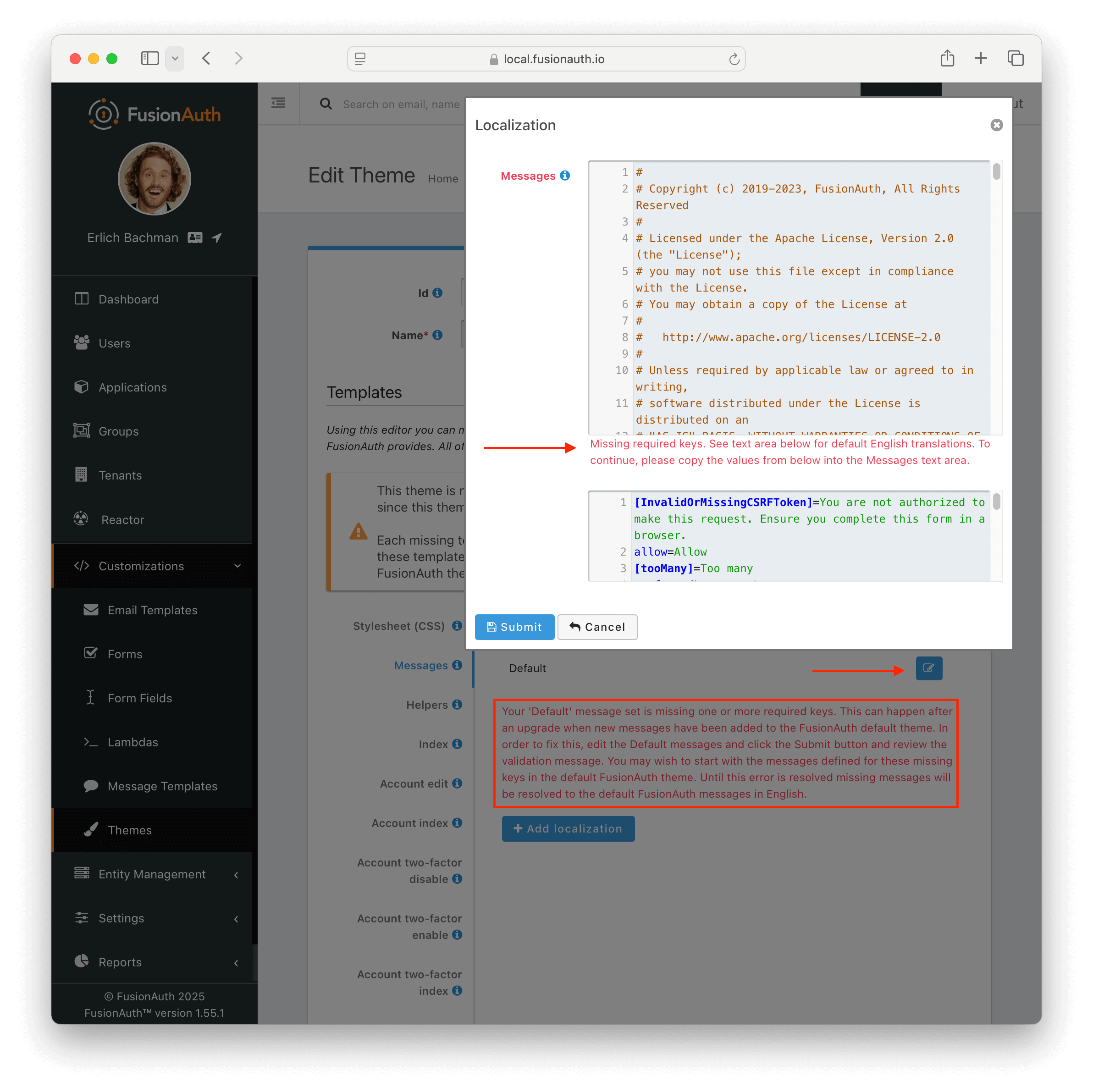
Theme Will Not Retain Change(s)#
If you have upgraded your version of FusionAuth and are using Advanced Theming, you may need to upgrade each theme.
On theme "save" in the UI, an orange icon will indicate specific pages needing attention and changes. You can click on each page, copy in the new theme, and start customizing.
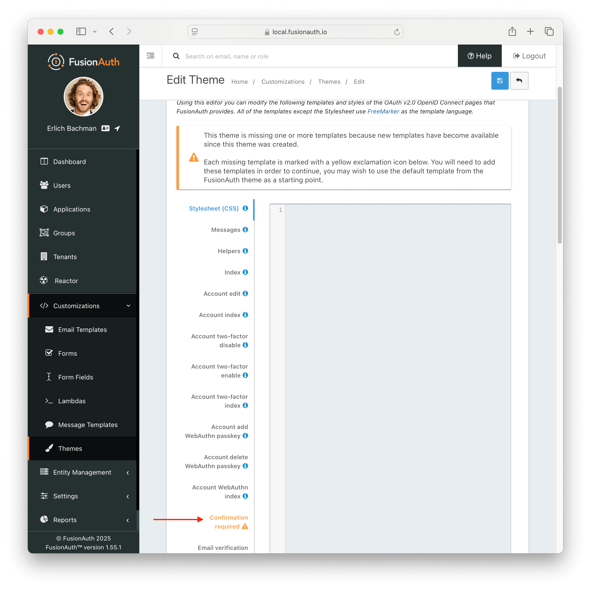
Additionally, in the messages bundle a validation notice will indicate the message keys to be added to support the newer FusionAuth version.
For more information about upgrading themes, see Upgrade an Advanced Theme.
Upgrading#
With simple themes, upgrading is simple, as the styles you've configured are applied to any new templates that are added.
New messages will automatically be applied to your theme after an upgrade. The only thing stored in your theme are customizations that override the default text.