Best Practices For Registration Forms
By Dan Moore
Signing up for accounts is something we're all familiar with. It's a gateway to applications we want and need. But it's not really fun. Or even pleasant. After all, we're signing up to access the application, not because we want to set up another username and password and enter personal data into yet another system:
You can make the registration form process simpler. And you should.
Summary - Registration Forms Best Practices
Key Takeaways#
- Streamlined user onboarding: FusionAuth's customizable registration forms and social login integrations reduce friction while maintaining security standards for any application type
- Flexible authentication options: Self-hosted deployment gives you complete control over registration flows, from simple email/password to complex multi-step processes with custom fields
- Enhanced security without complexity: Single-tenant architecture ensures sensitive registration data remains isolated while supporting passwordless authentication and MFA out of the box
- Compliance-ready data collection: Built-in GDPR, CCPA, and industry-specific compliance features protect user data throughout the registration process
- Scalable registration infrastructure: Handle high-volume user registration with minimal latency through optimized APIs and flexible deployment options
- Developer-friendly integration: Comprehensive SDKs and APIs enable rapid implementation of registration best practices without rebuilding authentication infrastructure
Definitions#
- Multi-step Registration: A registration process broken into logical steps to reduce cognitive load. FusionAuth's registration API supports progressive data collection with built-in state management and validation at each step.
- Passwordless Authentication: User verification through email magic links, SMS codes, or push notifications rather than passwords. FusionAuth provides native passwordless flows that integrate seamlessly with existing registration forms.
- Social Login Integration: Authentication through third-party providers like Google, Facebook, or GitHub. FusionAuth's social identity providers support over 15 platforms while maintaining user data ownership and control.
- Registration Stepper: A UI pattern showing progress through multi-step forms. FusionAuth's customizable themes and registration workflows support stepper implementations with server-side state management.
- Form State Management: Maintaining user input data across multiple registration steps. FusionAuth's session management and progressive registration APIs handle state persistence securely without requiring custom implementation.
Frequently Asked Questions#
Q: How can I customize registration and login screens with FusionAuth while following best practices?
A: FusionAuth provides fully customizable registration themes and forms that follow modern UX principles. You can modify HTML, CSS, and JavaScript for complete control over the user experience, while built-in responsive design ensures mobile compatibility. The platform supports progressive registration, custom fields, and conditional form logic to minimize friction while collecting necessary data.
Q: Can FusionAuth handle both simple and complex multi-step registration flows?
A: Yes, FusionAuth's registration API supports everything from single-step email/password registration to complex multi-step workflows with custom fields, validation rules, and conditional logic. The platform manages state between steps, handles form validation, and provides webhook integration for custom business logic during the registration process.
Q: How does FusionAuth implement passwordless login for registration forms?
A: FusionAuth offers native passwordless authentication through email magic links, SMS codes, and push notifications. Users can register and authenticate without creating passwords, reducing friction while maintaining security. The system handles verification code generation, delivery, and validation automatically, with customizable templates and expiration settings.
Q: How do I integrate social login to my application registration process?
A: FusionAuth supports over 15 social identity providers including Google, Facebook, GitHub, and enterprise options like Active Directory and SAML providers. Integration requires minimal configuration - simply enable the desired providers, configure OAuth settings, and customize the registration flow to collect additional data if needed while leveraging existing social accounts. FusionAuth also allows for the configuration of other OIDC compliant providers as well.
Q: How can identity providers help with GDPR and CCPA compliance during registration?
A: FusionAuth includes built-in compliance features for GDPR, CCPA, and other privacy regulations. The platform provides consent management, data retention controls, user data export/deletion capabilities, and audit logging for all registration activities. You can configure consent checkboxes, privacy policy links, and automated data handling to meet regulatory requirements without custom development.
Is a registration form needed at all?#
Before you start, ask yourself a fundamental question: does your application require registration?
While user registration to create an account is commonplace, every step required of a user before seeing the value of your application affects sign up rates. What can you do to avoid a typical registration process?
Let them try it first#
Potential users are trying to kick the tires on your application. From a 2020 masters thesis, A User-Centered Approach to Landing Page Optimization in a Software-as-a-Service Business (PDF):
"Visitors have several different needs before deciding to sign up and test the service. The most prominent need is understanding what the service offers and whether it could be a suitable solution for their problem."
Is there functionality, degraded or not, which you can offer to visitors? For example, if you are building a drawing application, can you let a user create and download a picture without an account? This degraded functionality will allow a user to see the value of your application with minimal investment.
If you are building a site which displays information based on a search, allow users to see a few results without signing up. While teasers may be frustrating to some, they also reveal the results' value.
In a 2013 study (PDF), Microsoft researches found the source of a sign up impacted conversion:
The more valuable services are more likely to be considered worth the privacy and effort cost of disclosing personal data, while the least valuable will not.
Allowing visitors to use your application, even in a limited fashion, helps them assess if a signup is worth their time.
Social or third party login#
You can also rely on a third party for account management. Would social login make for a smoother experience? If you are targeting enterprise users, can you integrate with internal identity providers such as Active Directory?
Different types of users will expect different third party auth providers. If you have a consumer focused application, almost everyone has a Facebook account, so offer that social identity provider. One less password for your potential users to remember and one less obstacle to them signing up.
If you are targeting enterprise customers, integrate with Active Directory or similar corporate directory. If developers are your target market, GitHub authentication makes for a simple registration process and signals that you understand their needs.
Passwordless#
Passwordless login allows a user to authenticate with something they have (access to a phone or email account) rather than something they know (a password).
While passwordless authentication requires providing some level of contact information, users do not have to create and remember yet another password.
All the above options provide an application with less data than the typical registration process. That's the cost. The benefit is less signup friction.
Ease the pain of registration#
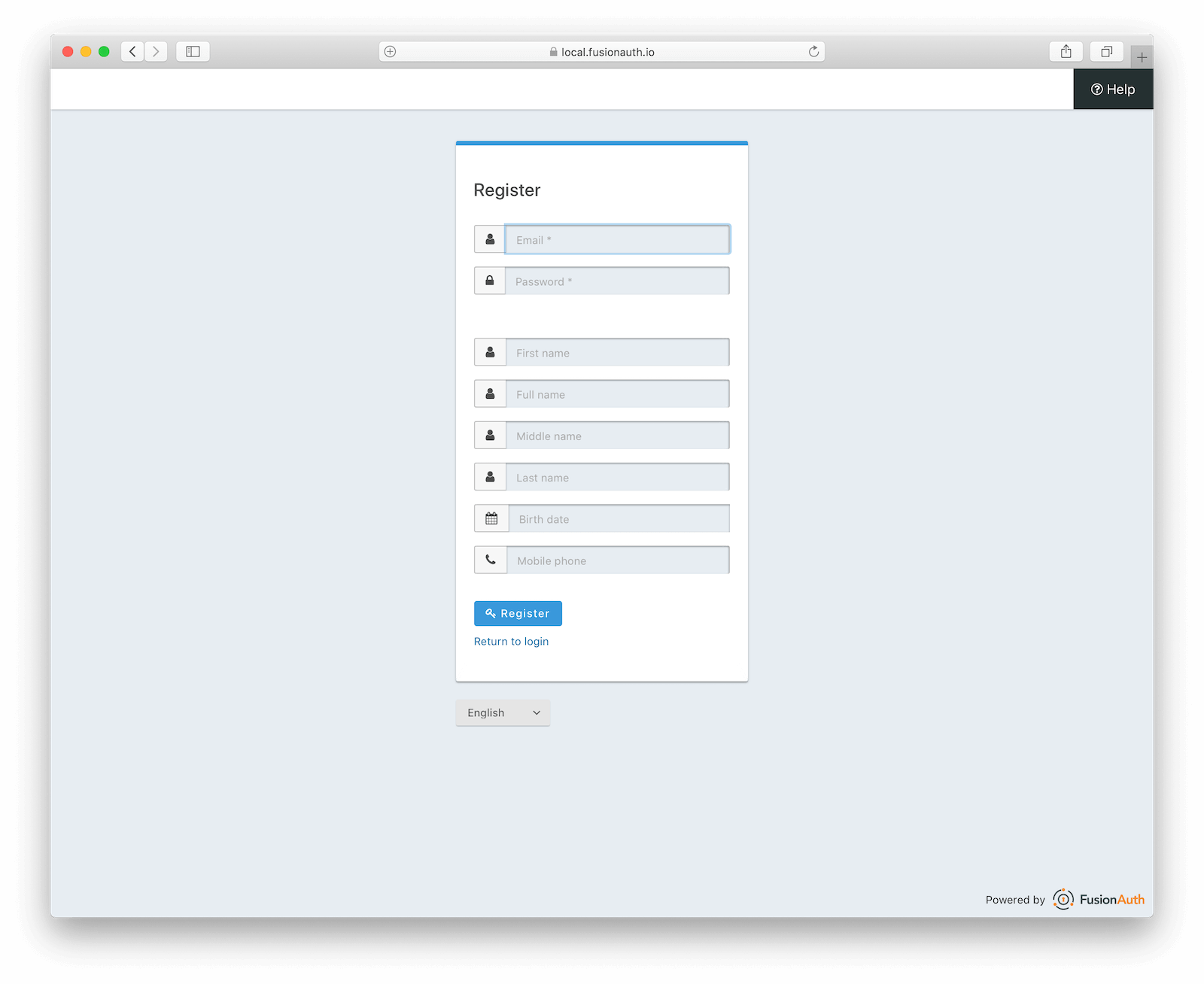
If you've decided you need a registration form, remember that it is a form first and foremost. You should follow known best practices.
A form is a form is a form#
The Nielsen Norman Group discusses improving forms in their 2016 article, Website Forms Usability: Top 10 Recommendations. The number one suggestion is:
"Keep it short. ... Eliminating unnecessary fields requires more time [to decide what data is worth asking for], but the reduced user effort and increased completion rates make it worthwhile. Remove fields which collect information that can be (a) derived in some other way, (b) collected more conveniently at a later date, or (c) simply omitted."
Carefully consider the information you are asking for. The fewer fields the better. While admittedly in a different context, Imagescape more than doubled a contact form conversion rate by decreasing the number of fields from 11 to 4. There may be data needed only for certain features of your application; ask for it when that feature is first accessed, rather than at signup.
Make sure your form is mobile friendly; test at various screen sizes. The tediousness of data entry on a mobile device and the prevalence of their usage are another reason to have as few signup form fields as possible.
If a form field is optional, clearly mark it so. Even better, don't ask for optional data on the initial user registration. Request that information later, when the user is more engaged and has discovered the value of your offering.
Provide clear error messages when data fails to validate. Use both client side validation, which is faster, and server side validation, which is tamper proof. On the topic of tampering, ensure any form is submitted over TLS. You want to keep submitted information confidential and secure.
Make use of the full suite of HTML elements. Dropdowns and radio buttons are powerful, but number and email input fields leverage browsers' built-in validation and should be used as well. If you aren't sure what's supported, use tools like Caniuse to verify compatibility.
Registration forms are unique#
But registration forms aren't just another form. They are the gateway to your full application or site.
What causes angst when a user is signing up? This 2012 paper (PDF) examined registration for government services. It defined sign up friction as "the imbalance between the business process (user goals) and [required] security behaviour" around signing up. This study found friction was best explained by the following attributes of a signup process:
- The number of new credentials required
- Any delay in the process, such as waiting for an activation email
- Whether registration requires an interruption of a user's routine
- The frequency of legally obligated use of the service
Obviously you can't control the last aspect, but minimize the number of new credentials, delays and interruptions in your registration process.
Most registration forms ask for a username and password. Make it clear what are valid values. If a username is an email address, allow all valid email addresses, including aliases.
Avoid complicated password validation rules. Allow users to use a password manager. NIST recommends a focus on avoiding passwords known to be insecure.
"[A]nalyses of breached password databases reveal that the benefit of [password complexity] rules is not nearly as significant as initially thought, although the impact on usability and memorability is severe." - Appendix A—Strength of Memorized Secrets, NIST Special Publication 800-63B
Obtain proper user consent. What this is depends on your plans for the requested information and what regulatory regime applies. Different levels of informed consent may be required. For example, if you are in the USA and are dealing with a child's personal information, you'll want to make sure you get parental consent because of COPPA.
Ensure new users enter sensitive data correctly. If there are any critical fields, such as a government Id, provide a confirmation field asking for the data to be re-entered to ensure the data is typed correctly. This is an exception to the rule of asking for less data. If the stakes of incorrect data entry are high, the additional work is worth the inconvenience.
If you need more than a few pieces of information on registration, consider splitting the sign up form into steps and using a registration stepper, also known as a multi-step form or a wizard. A stepper is a user interface element which shows how many steps are required to complete an action:
"Steppers display progress through a sequence by breaking it up into multiple logical and numbered steps." - Google's material design reference".
Multi-step registration#
Splitting up a registration form allows you to ask for more data, but avoid imposing a high initial cognitive cost on a potential user. It also allows you to track registration progress. Rather than a registration being an all or nothing proposition, you can see where people fall out of the registration funnel: is it because of step two or step three? It also may increase the conversion rate: Instapage saw an 18% increase in conversion rate when they split their registration form into multiple steps.
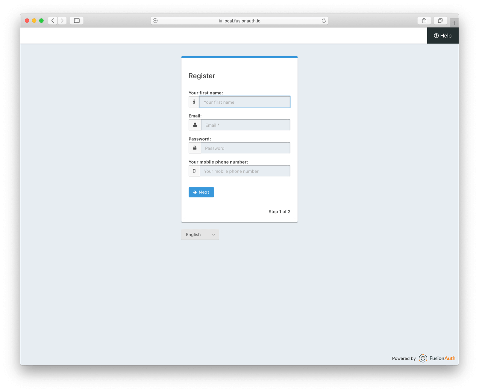
When creating the pages, group fields logically, as per the Nielsen Norman Group recommendations which suggest grouping "related labels and fields." Separate pages allow you to provide a contextual explanation of how providing the data will be useful to the visitor at each step. If you can't come up with a reasonable one, consider removing the fields.
Ask for as little as possible on the first registration step. Once they take that first step, they'll be more committed to finishing, thanks to our love of consistency.
Ensure you are clear about the number of steps the registration process will take. Doing so lets the user assess the effort involved.
Maintaining state#
Splitting a form up into multiple steps requires maintaining state across submissions. If you are using a framework, investigate helper libraries, such as wicked for Ruby on Rails or lavavel-wizard for Laravel.
If you are rolling your own solution, you can maintain state in hidden form parameters or in the user's session. Either way, you'll want to serialize entered and validated data and store it. Then, when the form is ready to submit, you can deserialize this value and process the entire form, typically saving it to a datastore.
Another option is to save registration data in the datastore and progressively add to the user's profile as they work through the steps. This approach has downsides, however. Either any required fields must be submitted on the first step, limiting flexibility, or you'll have to have a staging registration table, where partial registrations are stored until completed.
Sensitive information and multi-page registration#
Typically an application collects sensitive information in a registration form. Passwords are the canonical example, but other types of data may need to be treated carefully, such as a social security number or other government identifier.
When collecting sensitive data, keep it secure throughout the multi-page process. You have a couple of options:
- Don't ask for this information until the last step. Since the registration form will be sent over TLS, the sensitive data is then secure.
- Once submitted on any step, keep it in the server side session until the form is complete.
- Encrypt and store the form data in
localStorage. - After sensitive data submission, store it in a hidden form field, but encrypt it first.
Each of these options has tradeoffs. If you wait to ask for any sensitive information until the last step, you are limiting the flexibility of your form design. If more than one piece of sensitive data is needed, you're forced to put all of them on the last page.
Keeping the value in the session means increasing the size of your user sessions. You will also be forced to use sticky sessions, hindering the scalability of your application.
Storing the data in localStorage is risky, due to malicious code running in the browser. If you encrypt it, make sure the encryption happens on the server, otherwise the same code may be able to decrypt the data.
Encrypting the data and storing it in a hidden form field means additional processing. If you choose this, use a symmetric key stored only on the server side. Since you'll be decrypting the form field in the security of your server environment, the browser shouldn't need to read the data after the step on which it is submitted.